
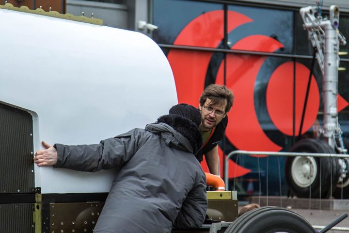
At the launch of the Bloodhound LSR project today, the team revealed a brand new logo and design for the project and car. The core colour scheme is red, white and silver/grey, with a logo that represents the shockwave generated after the car breaks the sound barrier.
The new brand livery illustrates the new business focus of Grafton LSR Ltd, the company behind Bloodhound LSR. The colour scheme will be reflected across the brand, including the new website.
The car is currently painted white with a red tail. For the first time, however, the project is offering ‘Livery Sponsorship’, which means that the real car may be almost any colour when it runs in South Africa. Repainting the real car is something that only wants to be done once, so its colour will not change until we have confirmation of the final design.
The Bloodhound LSR project will honour the commitment to put all the names on the tail fin that were paid for prior to the Administration period: this will be incorporated within the new design scheme.
The show car(s) will also be painted to align with the new livery, with sponsor logos added as they come on board.
The rebranding is intended to give a fresh new look to the project and provide clear water between the research and development phase and the future ‘running’ phase of the Project. The original blue and orange livery, complete with the logos of the sponsors who funded the project to complete the R&D phase and low speed (200mph) testing, will be preserved in historic images and videos.


